Creative Project: Cast of Characters

Here is the rough for my creative project so far:

creative project rough

In the center of the design is my new digital self-portrait, which you can see me make piece by piece by clicking this link here.

Around me are various characters that I have created over the years. Though these characters are from very old cartoons of mine and I wouldn’t show them off, I’m going to talk about them anyway because I think it might get some interest, and also I think it’s a valuable exercise to look into my past and learn about myself.

Cast of Characters

Morocco and Abitaka

morocco

Dated: Original 6 episodes, October 2003 – August 2004

Last appearance: “Creative Project”, May 2015

Current Status: Discontinued

An attempt at a “mature” cartoon set on an aquatic planet home to warrior tribes of fish, with a cast of characters inspired by the Simpsons, a story inspired on Blizzard games such as the Warcraft and Diablo series, and music taken from sound bytes from an old CD-ROM called Deep Voyage. It ran for 6 episodes, written by my brother and myself. Only Episodes 1 and 3, written by myself, were finished. More was planned for the show, such as a second series taking place in space, a feature-length movie, and a future timeline series. They were never made.

The series is a personal project that I do not recall fondly nowadays and it will not be released. So great was my shame of the show that from 2007-2008, I went to great lengths to hide the earliest versions of the first episodes, trying to remake them and destroy the old copies, changing Morocco’s name to Mackkaro, because Morocco is an actual place in Africa, and come on, giving your main character a name like that is just stupid.

However, I decided to redesign the characters specifically for the Creative Project, and I have been thinking of rebooting the series and doing a proper job at writing it, and these characters are still memorable to me, and I believe the show has potential.

Rocky and Angry Ed

r+ae r+ae new

Dated: Volumes 1-4, August 2003 – August 2009

Last appearance: Path of the Righteous, October 2012

Current Status: Discontinued

This was actually a cartoon meant to take place within the cartoon Morocco and Abitaka. Since that show was based on the Simpsons, R&AE was based on Itchy and Scratchy. It was a sketch cartoon about mindless ultra-violence that the protagonist, Rocky the Dinosaur, would deal unto the antagonist, Angry Ed the Dustbin. Oddly enough, Rocky was meant to be conveyed as a friendly and lovable character, but his only personality trait psychotic murderous tendencies would tend to suggest otherwise.

Despite its flimsy premise, R&AE saw a much greater success with its audience (my brother and myself), and got three 12-episode seasons, or volumes, with a fourth volume planned, but left unfinished. A huge and varied cast of characters was added to the show with varying levels of depth (ranging from one to TWO whole personality traits), while the titular Rocky and Angry Ed received a lot of character development and personality over the show’s running time. I recollect the series much more of a fondly than I do with Morocco and Abitaka, the show it was meant to originate from. After the initial four seasons, the show still proved quite a source of amusement long after episodes were being made, as episodes were remade in a highly satirical manner, redubbing the dialogue to be even more ridiculous.

Rocky and Angry Ed underwent a lot of remaking and visual redesigns, the latest being an update to Rocky’s design made in October 2012 (mostly just his feet – my brother and I argued SO much about what his feet actually resembled). Angry Ed’s design has remained mostly intact and he has been used as a generic villain in my other Powerpoint-related works.

Three days after Rocky’s redesign, an all new R&AE reboot episode Path of the Righteous was made in October 2012. No new episodes have been made since.

The StickKnights (StickKnights)

SKclassicstickknightspart2_prefight

Original Air Date: 2007-2010 (Original movie), Flash Remake – April 2014 – present

Latest Appearance: StickKnights Part 3: The Forest Fight – 18th September 2014

Current Status: On Hold

The first of a new generation, and the longest running in-development animated series that I actually want to finish and show off publicly. You can read about these guys in depth by clicking here!

Othal (GodHood)

othal pencil scaledOthal Mk II shadow

Date Aired: July 2011 – March 2013

Latest appearance: “Battle on Hallowed Ground”, April 2014

Current Status: On Hold

A huge and ambitious project by my brother and I to make the next best cartoon in the universe. (Whether we succeed or not is another matter entirely.) Currently on hold due to having of a ton of ideas and design concepts done for it, but we are unsure how to proceed with it and get the project started.

An animation of the first episode was done in DrawPlus, but it is missing voice acting and a soundtrack… and is a bit dated.

Currently this project is on the down low, and may undergo some changes from how it is now, so there’s not much to show.

“Scotty” the Cat

scotty cut out scotty irl

Back in England, he was a cat from the neighbourhood who seemed to adopt us as his second part-time owners. Living in Norfolk from 2007-2011 wasn’t the best experience we had, but having “Scotty” (that wasn’t his actual name, just the name we gave him) befriend us was quite an unforgettable experience.  Especially when I stopped him from eating a baby bird. To commemorate the times we had, I have immortalised “Scotty” in my art.

Cartoon Ben and James

okukikuben 2014

jimmy old new jimmy

Original Creation Date: 2004

Latest appearance: “8000 subscriber milestone”, February 2015

Current Status: In use

Digitised avatars created for my brother and myself. As we grew up and my artistry skills improved, our avatars have undergone lots of changes over time to better match our actual real life appearances.

Square (The Adventures of Square)
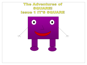
squareclassicend2

Original Air Date: June 2005 – July 2007

Latest Appearance: The Adventures of Square, 2014

Current Status: In use

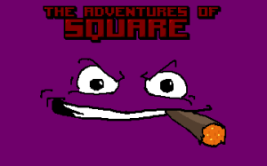
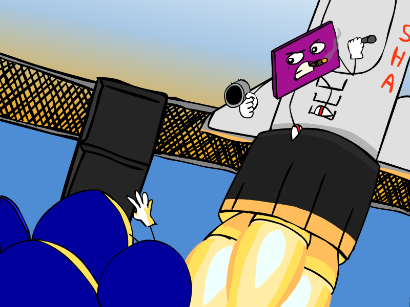
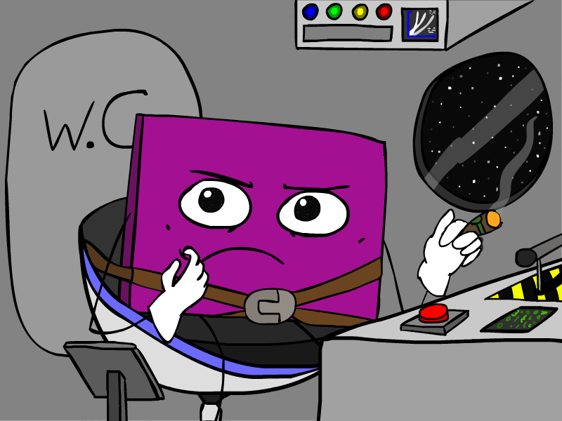
Square is one of my more simple concepts, now a fully-realised and highly acclaimed standalone game, for some reason. Read up on this purple fella by clicking here!

Creative Project: My Exegesis

My creative project is a digital collage of myself and my past work, forming a varied and visually appealing picture that serves as a definitive piece that demonstrates my artistic talents and skill, and showcases my own mythology of original characters. I wanted to create a piece of art that represented myself creatively, as I thought it would be extremely valuable to myself and to function as an advertisement for my personal brand, showing people what I am capable of, and drawing their interest to the varied cast of characters shows within the piece.

The piece was created digitally, in Adobe Flash CS6, and drawn with a Wacom Intuos Pro tablet because I have had a significant amount of personal experience creating art of this kind. I have drawn with pencil and paper for years, taking a special interest in it from 2011 onwards, and purchased a graphics tablet in March 2014 to be able to draw digitally. This gives the advantage of accessibility and security to my art, along with the ability to copy the elements and reuse them at my leisure. Adobe Flash’s vector-based images allows the elements to be infinitely scalable, allowing for the design to be used for many different things, including t-shirt designs, computer wall papers, badges, banners and stickers.

The piece is also inspired from a number of sources that provided invaluable insight to me in my studies.

Csikszentmihalyi’s writing about the Ten Dimensions of Complexity (1996, p.55), which outline what personality traits creative people generally have has also inspired me as a creative individual and highlighted the importance of understanding my own personality traits. Other sources like Jung’s writing on active imagination and self-actualization (1997, n.p.), and more modern sources such as Lasseter’s Seven Creative Principles (Reis, 2009) talk about what environmental and personal factors can influence creative people to function at their best.

I do personally agree very much with this idea of understanding oneself, and seeking to reach one’s full potential as an individual by discovering and overcoming their flaws.

To better understand myself, I wanted to look into my past creative endeavors and memories and see what observations I could make. Looking at my past work now, it seems that a lot of my creations are inspired by things that I have seen or experienced, and in a way, my creations are each an aspect or a trait of mine, simplified into its own character, such as the StickKnights often being in conflict with each other, despite still banding together and having the same goals.

I wanted to represent the element of “pure creativity” in the piece but I was not sure how. I was intending for some sort of visual paint-like motif, representing creativity as a liquid that ran in a loop in the center of the piece, around my head and all of the characters. I wanted to do this because I thought it would be a great and fun use of my imagination to represent something abstract like creativity in a visual way. Furthermore, this is inspired by the writings of Csikszentmihalyi who writes about the state of Flow, when a creative individual enters a state of immersion, focus and concentration in their work. My idea was to represent creativity in a liquid, paint like state and have it ‘flow’ throughout the picture. Unfortunately I wasn’t sure how to implement this and I did not have the time to include it in the final piece.

I have drawn inspiration from people working in the field of art and animation, such as Josiah Brooks, whose numerous online guides and tutorials have proven to be an extremely valuable tool for developing as an artist and thinking about my career.

The characters included are all past creations of mine that I have been fond of for a long time. These characters have undergone numerous redesigns and rewritings (two of which I drew for the first time in 8 years just for this piece) which shows the degree to which I care about these characters. Nothing about these were made up on the spot just for this piece. Furthermore, I wanted to represent their personalities through their expression to show the dynamics of these characters, to provoke the viewer’s interest and make them want to know more.

In all I am satisfied with the piece in its current state, however, I did not allocate the right amount of time to experiment with the piece, meaning that I limited my time to add more interesting and different elements to piece to accompany the characters. As mentioned before, the paint motive, representing the ‘flow’ of creativity, was not included, and the background is a simple gradient. With more time it could have included more abstract elements to make the piece look more interesting.

The digital self portrait is the element that took me the longest to make, and I think that it is by far the element that I am happiest with. I think the mix of colors of the piece is reasonable, and no color stands out too much or clashes with the colors around it, which I think is very fortunate, considering the colorful cast of characters featured in this piece. For the piece I wanted to try to represent the characters as being in a 3D space, despite being in a 2D drawing. I did this by positioning them so that they overlapped, as if they are standing in a crowd rather than in a straight line. Characters that are closer are larger and more spaced out while the ones at the back are smaller and closer together, giving an imagined sense of perspective, which I think works well, and gives depth and space to the piece.

Overall, while I am satisfied with the final result, I would not call this the definitive piece that it was meant to be, and I am not as proud of this piece as I was hoping I would be. I believe that the piece was rushed. I think that spending more time in advance thinking about the project, doing concept art of the characters, and doing a few drafts of the piece before starting on the final version would have allowed me to have developed the piece to a much higher standard. Other than time constraints, the piece did not prove very challenging, and I feel like I could have done more if I had allowed myself more time and looked at more external sources for inspiration.

References

Csikszentmihalyi, M. (1996). The Flow of Creativity. Creativity: Flow and the psychology of discovery and invention (pp. 107-126). New York: HarperCollins.

Jung, C. (1997). Jung on active imagination. (pp. 1-17, 28-33). (Ed. Joan Chodorow). London: Routledge.

Reis, D. (2009). John Lasseter’s Seven Creative Principle’s. Animation Magazine

Past Work #3: It’s Square!

When I was younger, I always loved cartoons and drawing. I would often draw and create characters straight from my imagination. I believed in these creations of mine and wanted them to have their own animated TV shows that I would create myself – in Microsoft PowerPoint.

Even before that, when I was very young, and quite new to computers, which I’ve been around all my life, my made a little drawing called “Square Goes Wrong!”, depicting a square with a face and stick limbs running about in a mad panic because he was painted the wrong colour and it was turning him evil or something.

Back in 2005, I created a “cartoon series” in PowerPoint devoted to Square. The formula was that Square would always overcome his circular rival Circy by transforming into a big block and squashing him.It was supposed to be a kids’ show, which is why it was so vapid and pointless.

squareclassic
Ugh. Yeah, I’ve got a few issues with this, alright.

Anything that happened on Square’s so-called adventures had any kind of meaning, conveyed morals or abided by any kind of sense. He wasn’t even perfectly square. But I’ll cut my past self some slack – it was only my imagination doing its thing, and I just simply wanted to personally experience the joy of creating something based on the cartoons I’d watched with my own material, regardless of its quality. If this hadn’t happened, Square wouldn’t be one of the most recent of successes, and still hold a special place in my heart today.

My brother shared with me a fascination for all things cartoony, and was an avid Doom modder and community member – he had experience with editing software and created cartoonish assets for DooM that he then fully coded into the game. Out of his massive repertoire of mods, one based on Square started, but was only very limited. The mod would go on to be fused with my brother’s other works and then undergo a massive aesthetic redesign to become The Adventures of Square that we know of today.

Check out the website!
Click to check out the official Square website!

I mostly left my brother to his own devices, as he made huge progress on this mod – it was clear that Square was going to be the next big thing in his repertoire, on a far larger scale than anything he’d done before – Square was going to become its own game. We tested it together, and my brother eventually asked me to provide Square’s in-game dialogue, saying one-liners after despatching his foes with his arsenal of paint-flinging guns. I threw myself into the role and after several long recorded sessions, I had revived the old character of Square and become him. From then on I felt more intimately connected to the project than ever before.

Furthermore, I was asked to draw cut-scene art for the game, as the project’s previous artist had left. So it was up to me to draw Square for the first time in nearly ten years:

square bimmy art

Just took me a while to get a design that I liked. Here are the graphics that made it into the game:

end1aend2end3

I didn’t stop there. Square proved to be so fun to draw that I made several of my own drawings, marking special occasions, such as The Adventures of Square being awarded the Cacoward by the Doom community.

squarecacoward

It still baffles me that such a simple concept with such… humble origins can become the newest, most exciting thing. It really goes to show the power of imagination and creativity. Square could well be my oldest creation, as that first little drawing dates back longer than I can remember, and I may never find it again. But with the Adventures of Square, he is now my latest triumph.

“Titlepic” art by Slax.

Square’s original concept and cutscene art by myself.

Past Work #2: The StickKnights

What started out as a small-scale class assignment in high-school, to do a “30 second animation with a story” became one of my most ambitious and longest-running animated projects ever.

SKclassic SKclassic_2

The original StickKnights movie was never finished, due to a number of factors – procrastination on my part, inadequacies of the animation program leading to frustration, multiple instances of data and backup loss, and other classwork taking priority. It was something I always wanted to get back to working on, but by that time I had moved on to Adobe Flash CS6 – and not regretted the decision in the least.

stickknightspart1_firstscene

Following a strong desire to make something of myself one January afternoon, I started on the massive task of completely remaking StickKnights for Flash – re-animating, rewriting, everything.

stickknightspart1_cave

My experience in Flash was very limited. I didn’t quite understand how the program worked, which led to sloppy animation and much frustration, trying to make the program do what I wanted it to do. Nonetheless, progress was made, and my understanding of the program grew more and more streamlined, after watching helpful guides and tutorials online.

stickknightspart1_monstar

I am eternally grateful to my brother for providing voice acting for some of the characters and the amazing soundtrack, made after the animation to match up with what was on the screen. I did not offer a lot of input in this stage, but whatever he sent me I instantly fell in love with.

StickKnightspreview

StickKnights Part I was finally released onto Youtube on 18th April, 2014. I deemed it a great success and it was a step closer to finishing StickKnights, a goal that I wanted to achieve since first starting it back in 2008. After 7 years, StickKnights had finally seen the light of day, with a built in voice cast and soundtrack – more than DrawPlus could ever hope to include.

stickknightspart2_prefight

After a few months, perhaps a longer break than was really necessary, I decided to continue StickKnights and work on the next part. This installment was much greater as it focused on the conflict going on in the world, both politically (inside the King’s court) and literally (the fight between the StickKnights and the monster).

stickknightspart2_advior

Animating my first ever fight scene was a long and hard process. I actually made all the different scenes separately, giving more of a break between each one, giving the second part less of the frantic pace of the first, and I think this was better to tell the second part’s story, and was a better way to direct my animations in general.

stickknightspart2_fight

To make it easier, I decided to draw a rough animatic version of the animation first. I was reluctant to do this, as it first seemed like doubling my workload needlessly. However this turned out to work to my great advantage. I could document all the little parts or takes that made up the scenes and put them in a list that I would then complete one by one, breaking up the workload which proved immensely helpful.

stickknights part 2 preview

It is because of this more organized and patient approach that I believe that StickKnights Part Two is so much greater than One. Part Two released on 25th August 2014.

Part Three was made at the request of my brother for a University project, working to a three week time-frame. This added time limit presented a new challenge for me. I was never good at working to deadlines. This would help me greater focus my efforts to produce results much earlier than before.

At this point, I had acquired a Graphics Tablet which greatly sped up the drawing process. I did the same roughing technique I did for Part Two, along with listing all of the different takes. The workload would prove to be even greater for Part Three than for Part Two, despite it not running for as long and not even being the full scene.

stickknightspart3_vermin

I completely remade the background for the forest by painting a massive forest backdrop and resizing and repositioning it for each new take. Under the time constraints, I think it was a good move, saving me a lot of time on backdrops by having only one, as the scene only took place within the forest.

stickknightspart3_itgetsreal

Many times I thought I was done with it, when I found that some of the footage had not been finished, or a noticeable glitch was still in the cut. This was maddening to me as I was so close to completion, but I was so paranoid of glitches that I had no idea when I could call the project done. Finally I finished it. It was an exhausting job, but I believe my effort was well worth it.

stickknightspart3_revival

The scene was completed on 29th May, 2014, and uploaded to YouTube later after much deliberation, because it was not the official, finished StickKnights Part Three, and the project has remained untouched since that day. Now that I have revisited it, I wonder if I will take the time to finish the movie. And if I will, when? Is it time to move on? Or is it time to do this movie justice and finish it once and for all? Will StickKnights ever see a sequel? Time will tell.

Till then, you can watch StickKnights along with my other animated projects here: https://www.youtube.com/watch?v=ABH4FiZWDLQ&list=PLPkP-wMt7nrD8gWECFp60RY0rtZml1L2l

(Videos contain mild violence and vulgar language. Viewer discretion is advised.)

Creative Project #1: The Face Update

ben face cartoonised

This is my digital self-portrait from October last year. While I was happy with the style, I think that for my creative project, and due to the extra experience I have gained in artistry, a reworking of the face is in order. Rather than try to modify the original, I will instead completely remake it from scratch, using the proper proportions of the human face as a model and putting a lot of time into roughing it – building the framework so the final result will resemble my idea as closely as possible. So here we go!

IMG_0247

We should work from an up to date source. Here’s a selfie, taken on the 11th of May. No tracing this time – that’s cheap. It’s more than within my ability to get the proportions down correctly without simply tracing the shape directly from the image. We are working with Flash which is extremely flexible and useful for minor tweaks that we will no doubt be doing all throughout the creation process. I drew this with the picture on my iPad right next to the computer screen, not in the Flash file itself.

1.1 face head diagram

We start at the very basics – a tall oval with a cross through it to denote the basic shape of the head and the direction it is facing (straight ahead). It looks nothing like me, but we’ll soon change that. This is the foundations, and we will gradually shape it as we add the details.

2.2 face head shape hair rough

Obviously my head is shaped differently than this oval. Let’s sketch out a basic shape that resembles the picture, and while I’m at it, also sketch out the hair as well. That will probably be the most complex part of this piece, so let’s have a go at it early on and try to be as “on-model” as we can so that we can be more accurate with the hair shape later on.

3.2 face head and face in proportionproportions_of_a_head_2(Arty Factory, 2015)

I am paying close attention to the proportions of the face, using both the model above and the photograph to make sure everything is in order. Working to a model is great, especially when you can internalise it, but I am not at that stage yet, so keeping reference material close to hand is very useful.

4.2 face facial features sans beard

So here are the eyes, nose and mouth. I am not concerned with drawing the lips, and will instead focus on a well-shaped mouth (which usually takes more than a few attempts). My cartoon style is more focused on simplicity than realism, so we just need to strike the balance between these things or the results will be uncanny – when the aesthetics look creepy and wrong. There’s a time and a place for that style, but it’s definitely not here.

Note that I am using lighter and darker shades of grey to distinguish the shapes on each layer without using loud, obnoxious colours. Appreciate the subtlety of the working process. Don’t self-induce eye strain.

5.5 face all layers

I thought of redrawing the hair a second time, just for more accuracy and an easier time in the final “clean-up”.  It’s important that it looks right, and not overly simple or messy.

6.face rough complete

And there is our “rough”! Why have I suddenly got the Merry Melodies theme playing in my head? That must be a good sign! Now, this is far from done. In fact, we’re actually going to use NONE of this for the final version! All this is just a foundation to “paint” a clean and pretty finished version on top. So let’s save what we’ve done and fade it into the background so it’s still visible, but won’t get in the way of the “painting” process.

This rough consists of 21 layers in all.

7.7 face clean outlines

We begin the “clean-up” by redoing the linework with clean, black lines. Here’s what the completed “clean-up” linework looks on its own. One must take extra special care at this point, in order to retain the shape of the rough that we’ve spent all this time drawing. If I was feeling confident enough, I would use only one layer for the “clean-up”, but colouring and adjustments are more difficult to do in the long run if all the different parts are fused together, so let’s stick with what we did for the rough and use one layer per shape. We can change what we had in the rough for the “clean-up”, for example, I tweaked the head shape for more symmetry, resized the beard and repositioned the facial hair and eyes slightly, and redrew the hair to be spikier than in the rough.

8.8 face flat colour

Now for the fun part – colouring! Here’s a flat colour variation of my piece! Looks great, but the face needs a little more definition. Hold on, I need to do some quick research on facial lighting…

9.face final colour edit complete

And here is our final version! Now the face has a lot more definition. I also tweaked the skin tone and hair colour to look a little brighter and more “natural”. So now, we have the centrepiece for our creative project!

split-lighting-pattern1 (Hildebrandt, n.d.)

We are using a photography technique called “split lighting” that I tried my best to imitate for the piece.

jazza4(Brooks, 2014, retrieved from YouTube)

The facial shading also draws inspiration from Brooks’ “cartoon face” lighting style.

Next up, the cast of characters who will accompany my face in this digital mural!

References

Arty Factory (2015). Proportions of the Head and Face. Retrieved from: http://www.artyfactory.com/portraits/pencil-portraits/proportions-of-a-head.html

Brooks, J. (2014). How to Draw a Cartoon Face. Retrieved from: https://www.youtube.com/watch?v=0QBrgKIy35M

Hildebrandt, D. (n.d.). 6 Portrait Lighting Patterns Every Photographer Should Know. Retrieved from: http://digital-photography-school.com/6-portrait-lighting-patterns-every-photographer-should-know

Wk10: Creative Environments – How Pixar Fosters Creativity!

The environments in which a creative individual operates in can be very influential in how well they can perform. Environment has many different meanings that can be applied to fostering creativity, such as:

  • a biological environment – the incidental surroundings and availability of resources
  • a built environment – created with the purpose of serving and encouraging creativity and collaboration
  • a social environment – where creative individuals can look to peers for sharing ideas and receiving criticism.

Creative individuals are not all alike, and personal preferences differ greatly between individuals. However an SBS world news study has found that low levels of lighting, ambient background noise, desk clutter and tipsiness can boost creativity and lateral thinking, along with writing by hand and going on walks.While this lifestyle may seem distracting or disorderly, it creates a healthy environment for creative thought and exploring of one’s mind. (Delistraty, 2014)

Some environments can have a negative influence on creative influence, such as one of poverty and oppression, which gave rise to the band The Clash, who joined up and formed a movement against the society that they lived in. They were among the first to establish the English ‘punk’ movement of the 1970s.

There are several companies that recognise the importance of an environment that fosters creativity, from multi-media businesses like Google, to more artistically inclined producers such as Aardman Studios, and our case study for this article – Pixar, the pioneers of computer-animated film.

In order for its employees to work at their best and hardest on their massive productions, Pixar creates an environment both systemically and socially. Edwin Catmull, Co-Founder and President of Pixar, writes:

Our philosophy is: You get great creative people, you bet big on them, you give them  enormous leeway and support, and you provide them with an environment in which they can get honest feed- back from everyone.” (2008, p. 6)

Pixar states that their movies are not the result of just one idea or “high concept” that is successful, but the suggestions of the 200-250 members of the team building on the initial idea until a fully developed film is made (Catmull, 2008, p. 4).

“The high concept… is merely one step in a long, arduous process that takes four to five years.” (Catmull, 2008, p. 4)

This puts importance on the acknowledging of peers, working in a group environment and taking extra special care in the creation progress, making sure that each new step taken is something that the rest of the team can work with.

Pixar recognises the value of creative thinkers and therefore caring for them and putting them in the best environment possible is in their interests. The individuals are placed at a higher level of importance than their ideas, as Catmull writes: “Smart people are more important than good ideas” (2008, p. 4).

To encourage its employees to work together, Pixar seeks to create an environment of mutuality, co-operation, honesty and sharing. At very regular intervals, ideas for new scenes are played out in animatics and shown to the rest of the group, so that feedback and criticism can be offered, so that the ones presenting can get advice on what to change or where to go next. This also helps to dispel their fear of showing their work by exposing them to criticism in an honest environment. Still, a lot of risk taking is involved and encouraged, as Catmull writes: “if we aren’t always at least a little scared, we’re not doing our job”. (2008, p. 4)

After a movie is shown, a post-mortem for the film is held – a retrospective review of the creative process. Catmull writes that:

 “Many people dislike project post-mortems. They’d rather talk about what went right than what went wrong. And after extensive time on a the project, they’d like to move on.” (2008, p. 1)

To help alleviate this frustration, Pixar asks the participants to list the top five things they would do again, along with the top five things they wouldn’t do again (Catmull, 2008). This balance of positive and negative feedback encourages the creators and allows them to learn from past experience at the same time without them being overly negative and critical of their work, or overly defensive.

Pixar are averse encourages its employees to explore and modify their ideas to the fullest extent until they become viable, so as to not interrupt the creative flow by discarding ideas or stating what will and will not work right off the bat:

“Instead of coming up with new ideas for movies, our development department’s job is to assemble small incubation teams to help directors refine their own ideas to a point where… those ideas have the potential to be great films.” (Catmull, 2008, p. 7)

To better understand Pixar’s mindset when dealing with creative people and setting up an environment to foster their ideas and encourage creative thinking, John Lasseter, director of Toy Story (1995), the first computer-animated movie, breaks it down into seven core values:

John Lasseter’s Seven Creative Principles

  1. Never come up with just one idea, as it means having a limited focus. Have three, equally great ones. You will be less focused on these ideas and can think more freely between them, granting new perspectives. Movies are made up of tens of thousands of ideas and suggestions, from character designs, every line of dialogue, the delivery of those lines and so forth are all the result of a huge team of creative, free thinkers. The group dynamic emphasises having lots of malleable thoughts to share around and meld as they are passed along the group.
  2. Remember the first laugh – write down jokes that are funny the first time and save them, so that they are not discarded when they go stale after being retold so many times in development. Preserving old content is important, especially if it is good enough to make it into the final product, i.e. a joke that gets a good laugh the first time it is told.
  3. Quality is a great business plan, period. No compromises should be taken with studios, publishers or anyone in a managerial role. The individual creator of the movie, idea or other creative product always has the last word.
  4. It’s all about the team. A group of people working on a creative project usually produce better results than just one individual. These groups should be honest, direct, and helpful to one another. Everyone should be treated as equals, and nothing that is said should be binding.
  5. Fun invokes creativity, not competition. It is always better to have people who can get along working together, rather than working against each other, or competing in similar roles. Co-operation goes a much better way in giving confidence to creative individuals and ensuring that the creation process is fun for everyone.
  6. Creative output always reflects the person on top. Bad tempered managers are no good, as negativity badly impacts the creative process. It is vital that creative individuals are No negative people should disrupt or impair the creative process.
  7. Surround yourself with creative people you trust. Creative individuals should work in a team of equally talented, or even superiorly talented other people. If they are good-natured and pleasant than that’s even better. Creativity requires a safe and secure environment. Insecurity do not mix. (Reis, 2009)

References

Catmull, E. (2008). How Pixar Fosters Collaborative Creativity. Harvard Business Review.

Delistraty, C.  (2014). How Environment Can Boost Creativity. The Atlantic. Retrieved from: http://www.theatlantic.com/health/archive/2014/09/how-environment-can-boost-creativity/379486/

Reis, D. (2009). John Lasseter’s Seven Creative Principles. Animation Magazine.

Wk9: Creativity and Copyright – The Digital Revolution

Copyright is an important part of the creative industries as they ensure ownership of a product to its creator and protects from theft or piracy. Copyright protection lasts as long as the creator’s lifespan, plus 50 years. When this copyright expires, and the rights are not claimed by a publisher, it becomes ‘public domain’ and becomes accessible to all.

There are lots of different opinions and views firmly held on whether or not copyright law is fair – whether it protects people’s content or stifles creativity and promotes censorship and greed. Some small-scale content creators don’t mind their content being used or copied if it means promotion and exposure for their product, while some have to be careful as piracy could result in loss of sales that would destroy their business and their career.

Each case is different, and if cases are taken to trial, the outcome is usually determined based on precedent. These views are usually biased one way or the other and attached closely to personal reasoning, and these beliefs can be hard to change, even in the face of research that proves it wrong, or contradictory (McIntyre, 2012, p. 176).

The earliest form of copyright law began in 1710 when the British Parliament enacted the Statute of Anne, which allowed book authors ownership of their books rather than letting publishers gain the rights to distribute products, and often restricted them in other countries, effectively censoring the product. The Statute of Anne entitled the book’s original creator with the protection and ownership of their product, allowing them to control its distribution. (McIntyre, 2012, p. 176) Royalties started in 1886 to reward content creators for the use and reuse of their work globally.

Copyright law first came to prominence in the music industry – the recording industry made up a huge portion of the US economy, making $38 billion in the 1990s. Copyright law is also important in “film, television, publishing, radio, news organisations, journalists and photographers” (McIntyre, 2012, p. 176).

However these laws have been hard to maintain with changing technologies and practices within an industry. The Internet, a huge and highly accessible system for freely exchanging and copying information, along with the increasing digitisation of content, has been said to “allegedly engender the free flow of commerce” (McIntyre, 2012, p. 177) by very easily allowing consumers quick, easy and free access to content that would normally be paid for. Wireless connectivity and communication, and services like Skype can provide almost everyone with the ability to send messages and electronic data around the world that instantly reach its destination (McIntyre, 2012, p. 176). This can mean the

It is much easier to take someone else’s product or material and reuse or modify it without the author’s permission. This has been the cause of varying levels of concern both for multi-billion dollar corporations and independent content creators (McIntyre, 2012, p. 180):

“To be able to perfectly replicate someone else’s content distorts the sense of ownership and uniqueness that comes with it, robbing the creator of its artistic merit and originality” (McIntyre, 2012, p. 180).

For this reason, it is argued that “copyright law, Romantic authorship and the significance of the author were ‘born together’” (Bently 1994, p. 974).

For this reason, laws have been designed for protecting Intellectual Property (IP), which is a non-physical form of property, such as digital products, ideas or designs that are owned by someone.

Wikstrom writes that copyright law is so important to the film, TV and publishing industries, they should be called copyright industries rather than creative industries, as copyrighting is essential for legitimising a creative piece of work to serve a commercial purpose (2009, p. 17).

In one particular case relating to journalism, a news outlet that reported news from other stations for free gained a large following, along with from other, non-official sources, such as search engines, generating traffic and ad revenue for those sites, and stopping the official source from gaining it (McIntyre, 2012, pp. 180-181).

There is a divide between consumers and producers. Consumers want to access information they want as quickly and conveniently as possible, arguing that, in accordance with the creator’s need for artistic expression, artistic works are meant to be shared and experienced, and that copyright law is outdated and contradictory to this idea:

“Perhaps no area of human creativity relies more heavily upon appropriation and allusion, borrowing and imitation, sampling and intertextual commentary than music” (McIntyre, 2012, p. 181)

The other side of the argument, made by content producers, is that they deserve the right of ownership to and compensation for what they create:

“There’s a saying on the Internet that ‘information wants to be free’. […] However, creativity is a different matter. Under the principles of copyright, we want creative works to be compensated”. (Samuels, 2000, p. 249)

Some pieces of art or music are specially made for a commercial purpose, and are less to do with artistic expression and freedom. For example, an artist may create a short jingle for a company’s advertisement. To the artist, this might be seen more as a service for monetary compensation than a labour of passion and self-expression. Copyright law is necessary to protect both the artist and the client.

 “Copyright will continue to be important in the international legal community for as long as we want to encourage the making of creative works” (Samuels, 2000, p.248).

Still, as evidenced by the massive changes to the music industry, it is worth investigating any and all new technologies that emerge, as it can have a profound impact on industry and complicates matters of copyright law and ownership, especially if laws are not swiftly put in place to manage the exploitative potential of new technology. “The idea of property dates far back in humankind’s history, where people hunted and gathered and carried their possessions with them. We no longer live like that.” (McIntyre, 2012, p. 194).

References

McIntyre, P. (2012). The Digital Revolution: Copyright and Creativity. Creativity and Cultural Production: Issues for Media Practice (pp. 176-194). London: Palgrave Macmillan

Final Project Planning #1: The Self Portrait

Let’s talk about my face.

As my final project is a large digital mural of sorts detailing my past creations from the earliest days to the present moment, I thought it would be fitting to digitise my face to serve as the centrepiece of it, with all the other characters spaced out around it.

Luckily I have done many self-portraits in the past, when I’ve had the inspiration to try photo-realism in my art, though normally it has lent itself more to more of a simplistic, cartoonish style.

First attempt: 30th September, 2012, sketched with pencil and scanned

You Look Like a Face

When I look at this, I can cast my mind back to an earlier time, when I didn’t really know what I was doing. I believe the mentality I adopted at the time, when trying to construct a piece that wasn’t in my usual familiar style, would be to simply copy the source photo onto the page, line for line, without a methodology to serve as a to building a foundation first to guarantee accuracy. Trying to hit a bullseye while blindfolded, I suppose.

Now I may have gotten the overall shape vaguely correct, but the lack of attention to detail and how the human face is proportioned does detract from the form and composition of the piece.

So let’s be really unfair towards my past self and fast forward a few years to a piece that is objectively much better.

Second attempt: 22nd March, 2015, sketched with pencil and paper

Self Portrait 03-15

Now you should notice that the overall form of this piece is more on point. That is, I have bothered to look into the theory of anatomy for the face, of which I only had a vague idea of before. Having the paper in portrait rather than landscape was also a wiser decision.

proportions_of_a_head_1proportions_of_a_head_2

(Arty Factory, 2015, n.p.)

I drew from observation – looking at my face in a mirror for reference. I implemented a many-layered technique to my drawing, laying down a rough foundation of the larger shapes first (the overall shape of the head), using a light pencil, allowing for mistakes and simply redrawing the shape when the proportions look a little bit off. While having to draw a piece in multiple stages can seem like extra work and is a bit of a turn-off, I have found that it is entirely worth doing, as it ensures that the piece is of greater quality and more accurate to my vision.

It has still been a while since I tried something like this, so it’s not the most polished attempt I’ve done. Some of the facial features are not perfectly aligned – the eyes, nose and lips are a bit lopsided and disrupt the symmetry of the piece. The hair was rushed and resembles more of a scribble than something with form and texture. Nevertheless, it’s progress. It’s simply a matter of trying again and again until I can better memorise and visualise the details and translate that physically onto the page.

The piece is lacking in shading (my beard is hardly even visible), as I mostly wanted to capture the basic form as best as I could. Shading, or tone, is something I should look into next, to create more depth to the shape of the piece and advance my skills even further.

Now that I have a better grasp on form and proportion, it’s time to move on from a traditional medium to a digital format and a different style that I intend to use for the final project.

But first, I wish to say that I wholly owe the style of this next piece to Josiah Brooks who very helpfully provided a tutorial for cartoonish portraits in Adobe Flash:

jazza1jazza2jazza3jazza4

(Brooks, 2014, n.p.)

  1. Basic, rough sketch of the face
  2. Inking, or Clean-up
  3. Adding shading in a slightly darker, more saturated skin tone (Use colour dropper to use colours directly from the reference photo)
  4. Flood fill in other colours– voila!

Keep that in mind – now, here’s my take on that method for my own portrait:

Third attempt: 11th October, 2014 – drawn in Adobe Flash CS6 with Wacom tablet

ben face cartoonised

This is the piece that I am most proud of, of all three versions, despite this not being the most recent.

Note the similar shading that I adopted for the piece – I am very happy with it as it gives the face some real definition without looking like nonsensical blobs. I tried to match the specifications of the video as best as I could. All in all I am very happy with the result.

Perhaps then, I could use this as a base for a more up-to-date version, since the piece is months old, and has a few flaws to be corrected (lack of symmetry in the beard, grrr). I feel that taking this piece and updating it with my current level of skill and knowledge will mean that I am demonstrating my current level of skill, while not just lazily pasting this image unedited into my final project.

This portrait was referenced from a photograph – not traced line for line, but I tried to keep very accurate to the source in the rough sketching stage. With that said, any major reworking at this point seems non-essential, but the piece does need an update. This will be the centrepiece of the final project, the thing that will stand out the most and catch the viewer’s attention. The idea is that they say “WOW!” and not “What’s wrong with his beard?!”.

Stay tuned for when I talk about the other elements that will go into the final piece – adding the of characters from the past, reworking them and featuring them in the piece!

References

Arty Factory (2015). Proportions of the Head and Face. Retrieved from: http://www.artyfactory.com/portraits/pencil-portraits/proportions-of-a-head.html

Brooks, J. (2014). How to Draw a Cartoon Face. Retrieved from: https://www.youtube.com/watch?v=0QBrgKIy35M

Wk7: Creativity and Industry – Hooray for Capitalism…?!

Design is a vague term and this makes it difficult to pin one solid definition on it. In the design industry, lots of designers focus on personal expression and creativity, while much fewer places focus on using design for more innovative and competitive purposes (Power, 2009, pp. 200-201). Design can allude to aesthetics, lifestyle, or “product progress, change and innovation” (Power, 2009, p. 201).

Scandinavian design originated in a showcase showing Nordic design, decoration and furniture. These products of the label are predominantly Swedish, but as they became immensely popular, the label it was given in the beginning stuck (Power, 2009, p. 203). However this kind of design has been endemic to the region for much of its history, with the Swedish Society of Crafts and Design being founded in 1845, which is the oldest standing design institute in the world (Power, 2009, p. 203).

Stockholm, in Sweden, has seen a high concentration of both creative and innovative movements compared to the rest of the world, containing “50% of all Swedish firms and 52% industry turnover” (Power, 2009, p. 203). This is due to a number of environmental factors. Similar firms with different ideas concentrated in a highly industrial area can allow for a lot of “collaboration, rivalry and competition”  (Power, 2009, p. 201) between these firms, which can mutually spur on their efforts. The outlets that come ahead can create a whole new market, influencing other nearby outlets to adopt a similar approach to serve this new market (Power, 2009, p. 201), thus the industry changes and evolves much quicker.

A Nordic survey taken in 2002 found that there were “11,199 Swedish firms – 5,631 graphic designers, 2,740 architectural firms, and 2,828 ‘other design’ firms” (Power et. al., 2004).These firms are predominantly small-scale, and deal in “graphic design, web design, industrial design and communications design in business-to-business services” (Power, 2009, p. 204), meaning that they provide and supply services and resources to other companies.

One must consider the factors by which this densely populated urban area sees so much industrial activity. Locality is an important factor, as companies are “sensitive to distance effects” (Power, 2009, p. 204), and accessibility to other services increases mutual productivity and efficiency for all parties involved, including customers and clients. Small-scale firms are flexible and able to adapt to market changes and not fall behind when market forces move on, and inter-company collaborative groups can be assembled quickly and easily for specific projects (Power, 2009, p. 204).

Examples of design in Australia include car manufacture, furniture, decorations, architecture and infrastructure, designer clothing, housing, appliances, leisure and recreation, high-end luxury items, computer-aided design and manufacture, hardware and software, graphics, transportation, and environmental. Each of these kinds of design are either practical things required to facilitate industry, items for leisure and luxury for consumers, or marketing devices that individual firms use to entice the consumer to use their services exclusively in an otherwise varied and competitive market. These competing business and the services they provide make up a thriving commercial industry, which is a benefit to governments, businesses and consumers alike.

Current industrial practices within Western Australia include housing, and infrastructure. The Perth area is very isolated and has a lot of potential room for expansion. New roads and highways are being built in important areas, such as the freeways, and within the city itself. This creates a short-term inconvenience to the population, as roadworks often close off areas, causing delay to drivers, but long term, the roads become more accessible, and can accommodate more drivers. There is also an increase of housing, with lots of land being cleared and put on sale, to be purchased and have office buildings or homes built upon them, from quiet suburban neighbourhoods (including my own) to expensive custom-made luxury homes on the coastline.

However, this is very damaging to the environment, as natural woods and wildlife habitats are destroyed to make way for new roads and housing. Many species resident to Western Australia have seen declining numbers as a result of their habitats being destroyed, such as the Carnaby’s Black Cockatoo, declared Endangered by the Environment Protection and Biodiversity Conservation Act 1999 (Australian Department of the Environment, 2004).

References

Power, D. (2009). Creativity and Innovation and the Cultural Economy. Routledge, Hoboken.

Power, D., Lindstrom, J., and Hallencreutz, D. (2004). The Future in Design – Country Report: The Swedish Design Industry. Oslo, the Nordic Innovation Centre.

Australian Government Site (2004). Department of the Environment. Retrieved from
http://www.environment.gov.au/biodiversity/threatened/publications/factsheet-carnabys-black-cockatoo-calyptorhynchus-latirostris